PDF Extra

Everybody is extraordinary and PDF Extra provides people with the necessary tools to make extraordinary creations.

Brand Strategy

We worked with the MobiSystems team to identify their brand voice and determine their brand attributes as vibrant, creative, and productive. Although easiness is an important outcome for working with PDF apps, we instead focused on “creativity” for both the visual strategy and the key message of the brand. Creativity is the power source of a creation and it is also an attribute to the problem-solving skills of humans.

Brand Voice

The PDF Extra brand voice is enthusiastic, sincere, and expert. To users of the app the productive life isn’t checking to-dos in an endless task list; it’s the choice to be free and creative. They put heart and honesty into everything they say. Their voice reflects their capability, integrity, and experience – and makes others feel competent as well. They are vibrant, encouraging, and results-driven..

Work

  • Brand Strategy
  • Brand voice
  • Visual language
  • Design
  • Interactive
  • Social

Creative concept

We established a brand story for PDF Extra that aligns with their mission and vision and empowers their team: “Everybody is extraordinary and PDF Extra provides people with the necessary tools to make extraordinary creations. […] To keep the spark, we inspired users to share their success stories in the #ExtraordinaryCommunity of the company.

Visual language

The visual system has polish and personality: the modern typography adds simplicity, the curated photography feels genuine, and the ownable graphic work exudes balance and synchronicity. The color palette consists of tonal reds that communicate energy, creativity, and boldness.

Interactive

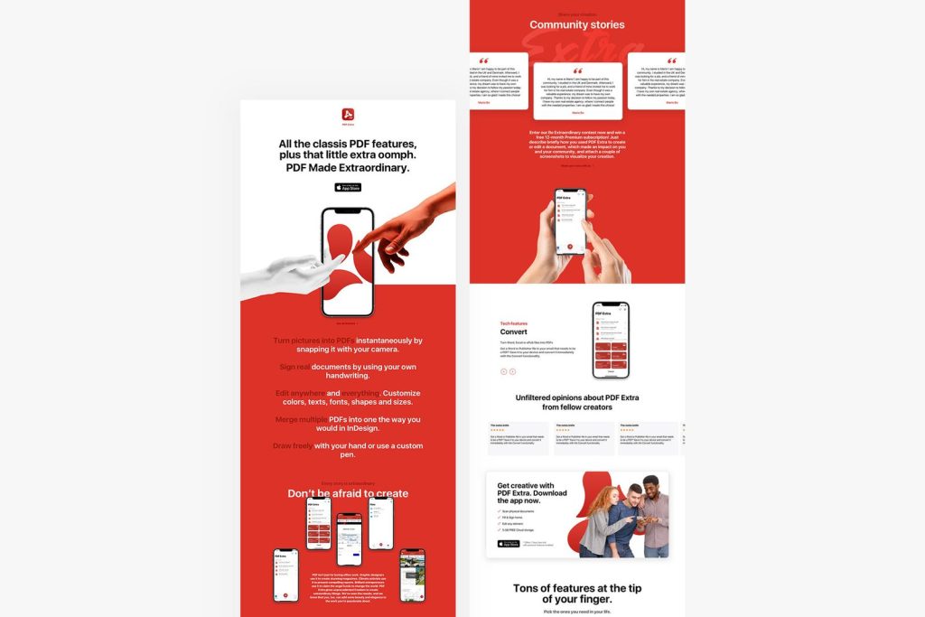
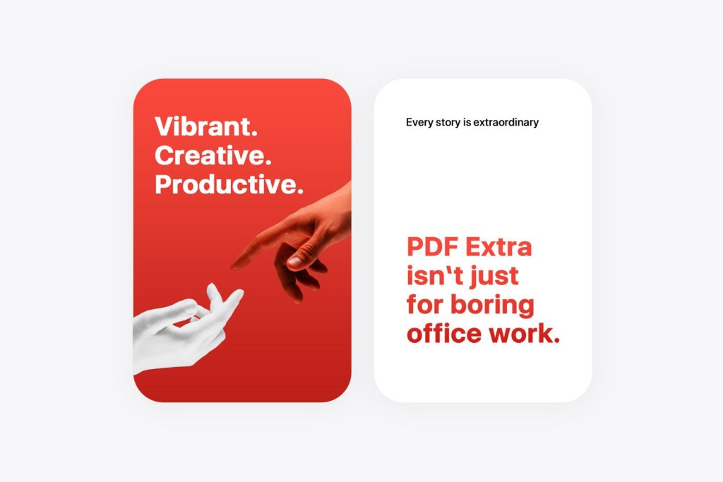
PDF Extra is a remarkable app that needed a landing page, which felt equally extraordinary. We started with the brand attributes: vibrant, creative, and productive. As an artistic touch, we used the hands on the famous Sistine chapel as a metaphor for the bond between individuals and technology.

Typography

The American (San Francisco) Font SF UI Display a.k.a. “The Apple Font” is licensed sans-serif typeface by Apple Inc. This typeface is characterized with its flexible and neutral elements. We use it to create a slick and modern user experience.

To me, Brandly is a like-minded person. I therefore very much appreciate your musketeer approach. My experience has shown me that business partners are found rather easy, but true like-minded people are very hard to find. Whenever you tackle a project, you take it on as your own and deliver more than what is expected. You take it personally, emotionally and professionally.
Raya Mayer​
Marketing Director, Mobisystems​